

TYPOGRAPHY / INVITATION / EDITORAL
A typography-focused project exploring an existing typeface, Novantique Script, across invitation, editorial, and digital applications. The work uses the typeface’s flowing, expressive character to establish hierarchy, rhythm, and an elegant visual tone across formats.
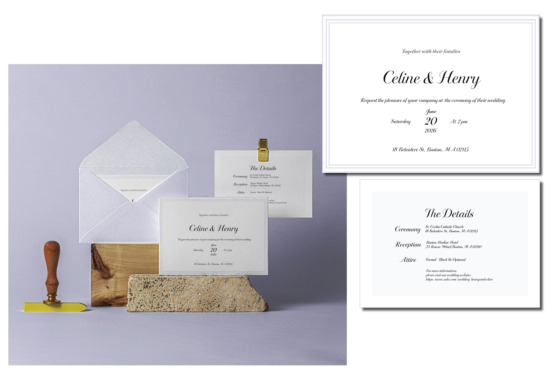
Wedding Invitation Suite
The invitation and details card use Novantique Script as the expressive focal point of the suite. Scale, spacing, hierarchy, and supporting type create a coordinated stationery system that balances decorative character with readability.
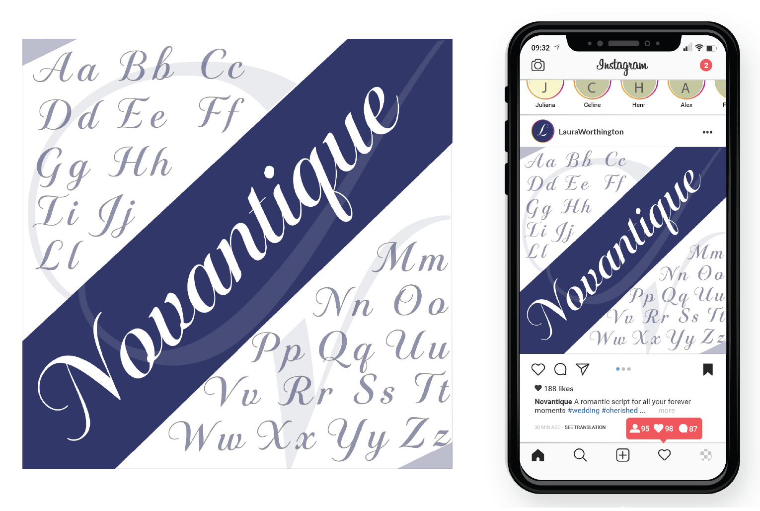
Digital Application
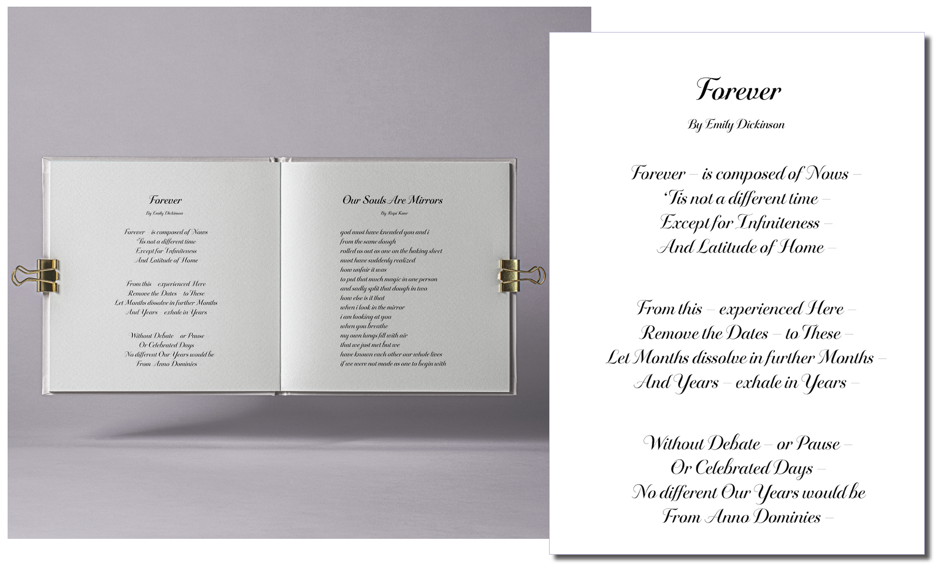
Editorial Application
Additional applications explore how the same expressive typeface can shift across formats. The digital tile emphasizes its decorative character, while the editorial spread uses typography to create rhythm, pacing, and hierarchy.